
Popular in Operations
Best Property Management Systems of 2026
Your hotel's core operating system to effortlessly manage bookings, guest experiences, and operations.
Best Staff Collaboration Tools of 2026
Enhance team collaboration with real-time messaging, task sharing, and centralized updates across departments.
Best Hotel Accounting Software of 2026
Tools to manage your hotel's accounting, budgeting and financial planning.
Popular in Revenue Management
Best Revenue Management Systems of 2026
Maximize revenue with dynamic pricing, demand forecasting, and automated data insights.
Best Channel Managers of 2026
Hotel distribution software that syncs rates, availability and inventory across 3rd party channels
Best Business Intelligence of 2026
Say goodbye to spreadsheets and leverage modern BI tools to visualize your data and uncover hidden insights.
Popular in Marketing
Best Hotel CRM & Email Marketing of 2026
Turn guest data into action with personalized offers, targeted communication, and automated workflows.
Best Booking Engine of 2026
The eCommerce shopping cart for your hotel's website.
Best Hotel Metasearch Management Software of 2026
Setup, manage and optimize advertising campaigns across channels to drive direct bookings.
Popular in Guest Experience
Best Hotel Guest Apps of 2026
Enhance stays with a guest app offering amenities info, messaging, mobile ordering, and upsell opportunities.
Best Contactless Check-in of 2026
Empower guests with easy online check-in, digital authorizations, and seamless upsells.
Best Guest Messaging Software of 2026
Connect with guests instantly through real-time messaging, automated responses, and seamless communication.
Sorry, this functionality is only available for verified hoteliers
The project dashboard is a free tool that is only available to verified hoteliers to make adopting new technology easier by streamlining their research and simplifying their communication workflow.

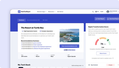
Get Your Free AI Analyst Report
Custom recommendations tailored to your property


