
Do you want to reduce your reliance on online travel agencies like Booking.com and Expedia? As a hotelier, you might struggle to compete with these big players for visibility on search engines like Google via SEO or even their Google Hotel Ads product with paid placements, but there’s another way to put your direct website in front of potential guests: metasearch. This advertising avenue can lead to more direct bookings, a stronger online presence, and even decreased marketing spend when used strategically.
Whether you’ve never heard of metasearch or are looking for tips to optimize your metasearch bids, this article is a good resource for all things meta. When you’re done reading, you’ll probably be in a hurry to shift some of your marketing efforts away from pay-per-click ads and toward meta instead!
Metasearch: The Basics
In general terms, metasearch engines aggregate results from a variety of search engines. These sites are not unique to the hotel industry; you can find metasearch engines that compare prices on everything from clothing to electronics to airfare.
Let’s say you’re in the market for a new set of Bose noise-cancelling headphones. You could manually shop around to find the best price, or you could use a metasearch site like Google Shopping, which would show prices and links to buy Bose headphones on retail websites like Amazon, Best Buy, and Bose.com. You would then complete your purchase on one of those linked websites.
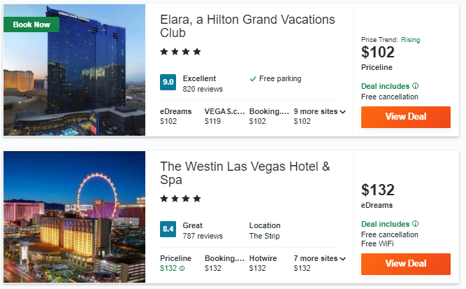
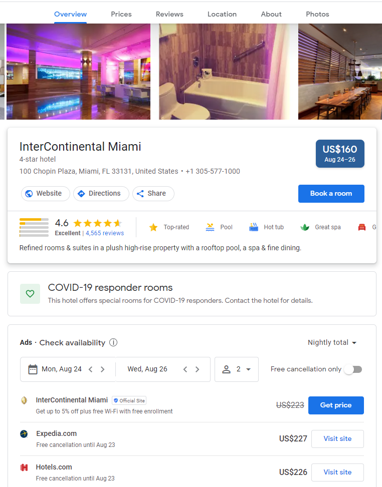
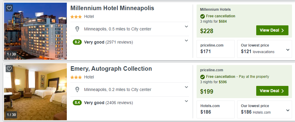
Hotel-specific metasearch engines work the same way. Travelers enter search terms, like their destination, travel dates, and number of guests, then the metasearch site delivers search results that include hotels that meet their criteria. Each hotel listing, similar to in our headphones example, shows that hotel’s rate on several different booking sites, like Expedia, Booking.com, Hotwire, and more. The hotel listings often aggregate guest reviews, photos, amenity information, and policies too. Travelers click a link to one of the channels and complete their booking there.
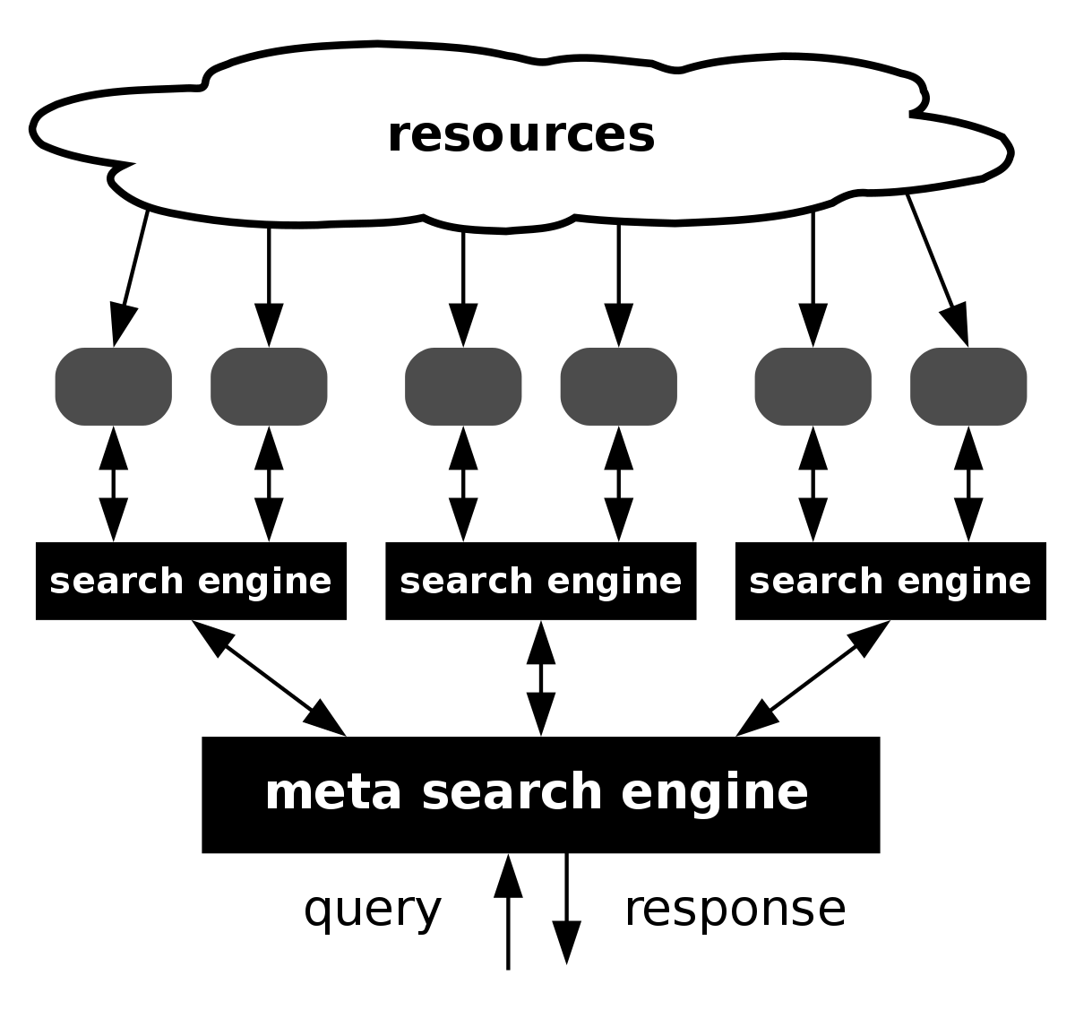
Since there are more booking sites than can fit on each hotel’s search results listing, the metasearch site uses a bidding model to determine which channels receive prime placement. Sometimes the featured channels do not even offer the cheapest rates - they’re just the ones who pay the most for placement. Depending on the metasearch site’s structure, the booking sites offer a certain fee per click, fee per impression, or a percentage of booked revenue. The sites with the highest bids win the top spots on the listing.
The big OTAs like Expedia and Booking.com employ entire teams to manage their metasearch strategy, but that doesn’t mean your own website can’t win placement too. Continue reading to find out how.
What are the Top Metasearch Sites?
Before we talk about why metasearch sites are important and how you can leverage them, you may be wondering who the biggest sites are. The top metasearch sites in the world include Google, Tripadvisor, Kayak, and Trivago.
Google is relatively new to the hotel side of metasearch, having launched their Hotels product in 2019. Hotels can not only bid on ad placement, but also add custom text and receive a blue “verified” check mark which builds credibility.
Though Tripadvisor might be best known as a review site, it’s also a metasearch channel. Rates from a variety of channels are shown on your hotel’s Tripadvisor page and in the search results for your market. Tripadvisor is one of the most popular travel sites in the world, often getting over 100 million monthly web visits.
As one of the first price comparison sites specifically for travel, Kayak is a metasearch engine for hotels, flights, rental cars, and more. It’s owned by Booking Holdings, the parent company of Booking.com, Priceline, and Agoda, and the site had 44 million hits in January 2020.
Like Kayak, Trivago is another metasearch site owned by an online travel industry company. Trivago’s parent company is the Expedia Group, which also owns Expedia, Hotels.com, and Hotwire. While Trivago’s monthly traffic is significantly smaller than Tripadvisor and Kayak, with between 10 and 20 million visits per month, its user base is international, with about 40% of visitors based outside of the US.
Why are Metasearch Channels Important to My Hotel?
Metasearch sites offer opportunities for hotels to increase online exposure, generate bookings, and increase your share of direct bookings. Though these sites might not always be top of mind because they don’t actually process bookings, they should still be part of your comprehensive hotel marketing strategy.
Metasearch sites enable you to engage guests you wouldn’t normally reach through your standard channels. Travelers who are brand-agnostic or just want a great deal turn to metasearch sites to find the lowest rates or do some convenient comparison shopping. These travelers usually aren’t loyal to a certain booking site or chain (otherwise they wouldn’t be using metasearch!), so you have an opportunity to convert them into loyal guests of your hotel.
Furthermore, metasearch can be a cost-effective way to gain more direct bookings. Even if you factor in the ad fees or commission you need to pay the metasearch site, your direct bookings that come through Kayak or Trivago will likely cost less than your traditional OTA bookings - or even pay-per-click advertising like Google Ads. Couple your paid placement with an exclusive price or amenity for direct bookers and you can grab the attention of travelers who might normally book via Expedia or Booking.com.
How Can I Maximize My Hotel’s Visibility on Metasearch?
Top rated digital marketing agencies like Net Affinity often provide meta search services and it's not recommended to go this route alone as budget can get eaten up and wasted quickly if you're not experienced. The other benefit of working with a tech and services provider like Net Affinity is that these players provide integrated services meaning that they'll have a holistic view from ad impressions through booking conversions so they can test and improve strategies more quickly taking full ownership over your booking funnel.
The first step toward better metasearch visibility is to set up a connection between your own booking engine, usually through your PMS or CRS, and each metasearch site. Metasearch sites offer integrations with a plethora of hotel software providers so that potential guests can always see accurate rates and availability.
For busy directors of revenue or marketing managers, metasearch management systems can streamline several aspects of your marketing strategy. These systems can place automatic bids on ad placements, target certain audience characteristics, and run detailed reports to further shape your strategy. The goal of metasearch management software is to ultimately increase your return on ad spend (ROAS) so that each dollar you spend on metasearch results in more booked revenue.
But metasearch management software isn’t essential to every hotel’s metasearch strategy. Your hotel can find success by integrating your existing software with metasearch channels, studying your metasearch performance trends, trying different types of promotions or ad copy, and optimizing your hotel’s website. Remember that after a traveler clicks off the metasearch site and onto your direct website, your website must perform seamlessly in order for that booking to actualize.
Even if you don’t plan to allocate some marketing budget to metasearch, you should still conduct frequent audits of your metasearch listings to ensure your content is up-to-date and accurate. Most metasearch sites let you set up a free admin account to upload photos and manage content so you can be sure guests have access to the best information.
Ready to launch your metasearch strategy? These sites can be valuable partners to any hotel seeking to grow direct bookings, increase online visibility, and shift share away from the OTAs. Do you have any questions about using metasearch sites? We’d love to hear them!
Need help managing your metasearch website marketing? Check out our list of top metasearch ad management software
